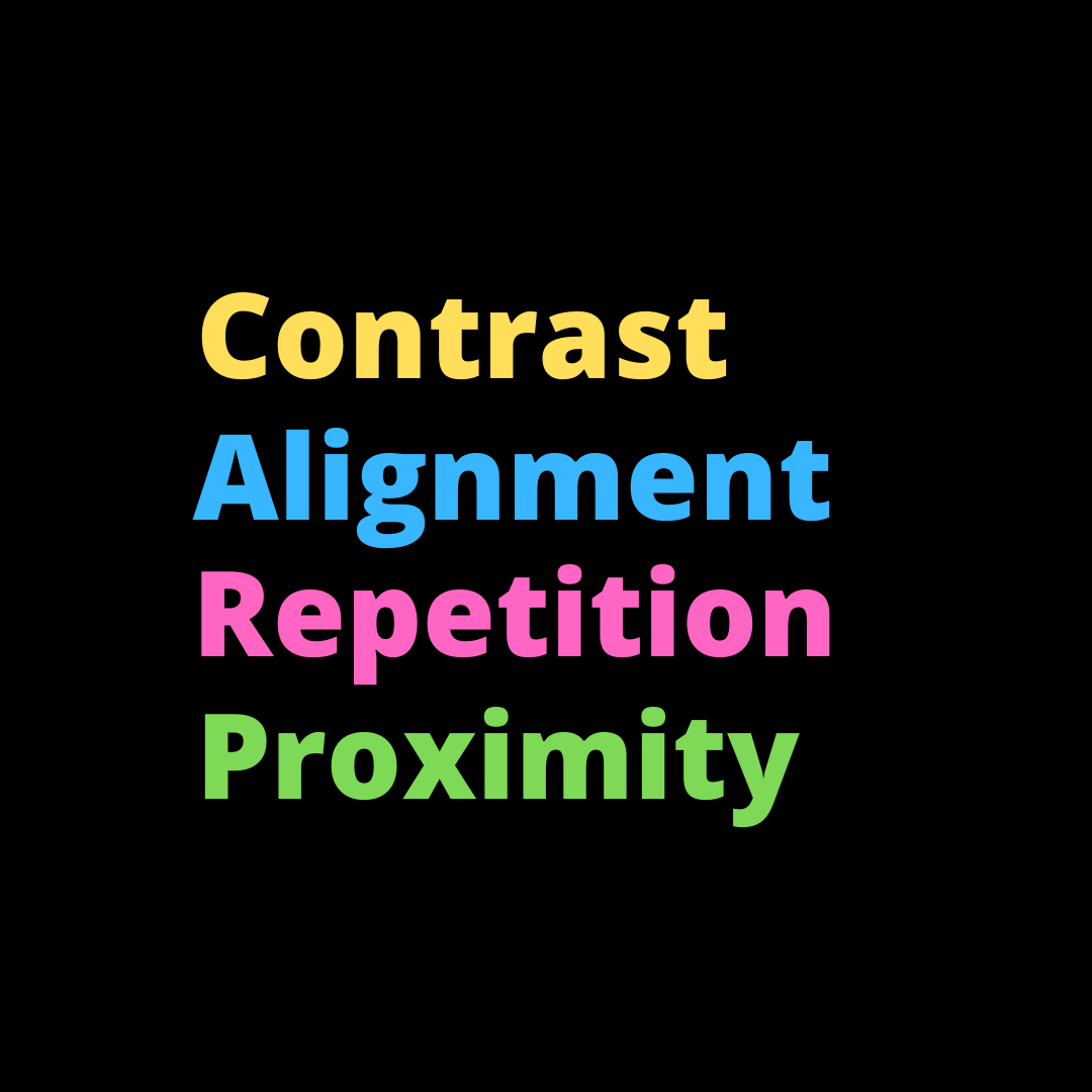
Graphic designers often talk about guidelines for visual appeal that they refer to as the CARP Principles. CARP, as you see here, is an acronym. The four words contained in it are Contrast, Alignment, Repetition, and Proximity. So, are these ideas just a matter of taste? Or could they save a life?
Contrast makes words and sentences easy to read and provides a powerful way to highlight something important on a viewers first glance. The lighter this typeface is, for example, the more effort is required to read the words against the eggshell white background of this blog page. Responsible communicators want their readers to use their mental energy on processing the ideas — not on deciphering the hard-to-read words on a page.
Alignment is another tool that helps readers mentally classify the information on a page at first glance. Things that fall into a predictable visual order must be related somehow, they think. Words or images that fall into line tend to convey ideas and feelings that also fall into line. By violating the expected rules of alignment, a creator can quickly draw attention to something that he or she wants to highlight.
Look at this screenshot of the main page of the Veterans Administration website. An organization that uses blue and white as its main color palette and yellow-gold as a highlight has placed a BRIGHT RED clickable box ABOVE the main webpage. A veteran in crisis will see it in the first seconds the page loads. By using the principles of Contrast and Alignment, the Veterans Administration has made its most urgent function — saving lives — easily accessible to all its webpage visitors. (Good job, VA!)
From www.va.gov.
Repetition, on the other hand, is an excellent tool for branding. And branding is an excellent tool for helping viewers (1) feel comfortable and (2) remember what they’ve seen. This principle covers a designer’s decisions to use the same family of typefaces, the same color palette, the same logo — even the same style of language in text. In a training program, it also refers to repeating key pieces of information a few times: first, in an overview; next, in detail; and finally, in a summary.
Proximity is about space. Viewers assume items that appear near each other are related, and a good designer takes advantage of this to help viewers and learners make important connections. A little further down on the main page of the Veterans Administration website, you can see these last two CARP principles used to full effect to help the pages’ visitors quickly and easily find what they need.
From the main page at www.va.gov.
CARP in Webinars: Webinars are a unique medium because they are accompanied by at least one live trainer, narrator, or speaker providing an audio presentation. A good script, as spoken by a human voice, can provide so much help to listeners, to viewers, and to learners. But people are people, and that means visual cues go a long way toward helping them grasp content more quickly. Which of these four design principles is the most obvious, the most quickly understood?
For me, it’s always been contrast.
This is why a one-line paragraph works to reclaim your reader’s attention in business writing. I mean, look at all the white space that surrounds that sentence above this paragraph, especially compared to the larger paragraphs above and below it. This is why the black box with the brightly colored words of CARP on the top of this blog post caught your eye.
And this is why a troubled veteran who needs urgent help can find it — and find it quickly — at the Veterans Administration website.


